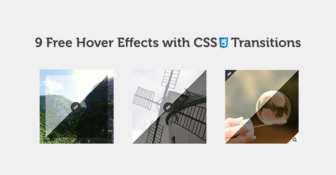
This image hover animation set is created with an intend to offer users, like me, smooth animation for their designs. As you would see in the live preview, the set has 2 overlay style and 3 buttons animations that are described in details below to guide you for ease of application. This is my first set of freebie, so I will appreciate your feedback, guys. Hope you like them.
Overlay Example 1 :
It’s a rectangle shape which separated to 2 triangles with different colors.
<li class="imgHover triangleScale style1">
 <img src="img.jpg"/>
</li>
<style>
.imgHover.triangleScale.style1:before, .imgHover.triangleScale.style1:after {
 border-width: 250px; /* Image Width */
}
</style>
Overlay Example 2 :
It’s the same rectangle shape, but shifted from the side by 20px.
<li class="imgHover triangleScale style2">
 <img src="img.jpg"/>
</li>
<style>
.imgHover.triangleScale.style2:before, .imgHover.triangleScale.style2:after {
 border-width: 210px; /* Image Width - Shifted space * 2 */
}
.imgHover.triangleScale.style2:hover:before {
 left: 20px;
 top: 20px;
}
.imgHover.triangleScale.style2:hover:after {
 right: 20px;
 bottom: 20px;
}
</style>
Button Example 1 :
This button starts from the upper right corner to the center of the image.
<li class="imgHover">
 <img src="img.jpg"/>
 <a href="#" class="cornerLink"><span class="cr-icon-link"></span></a>
</li>
Button Example 2 :
This button will scale from 0 to 1 in the center of the image.
<li class="imgHover">
 <img src="img.jpg"/>
 <a href="#" class="scaleLink"><span class="cr-icon-link"></span></a>
</li>
Button Example 3 :
This is 2 buttons triangle shaped, in 2 opposite corner.
<li class="imgHover">
 <img src="img.jpg"/>
 <a href="#" class="topLeftLink"><span class="cr-icon-link"></span></a>
 <a href="#" class="bottomRightLink"><span class="cr-icon-search"></span></a>
</li>
